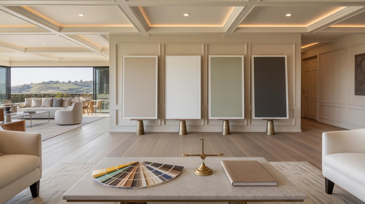
Choosing paint tones transforms living spaces and shapes how interiors feel. Color influences perceived size, mood, and light in rooms. Local climate and architectural styles in Walnut Creek affect color choices. The following sections explain practical steps and scientific principles for selecting paint tones for every room.
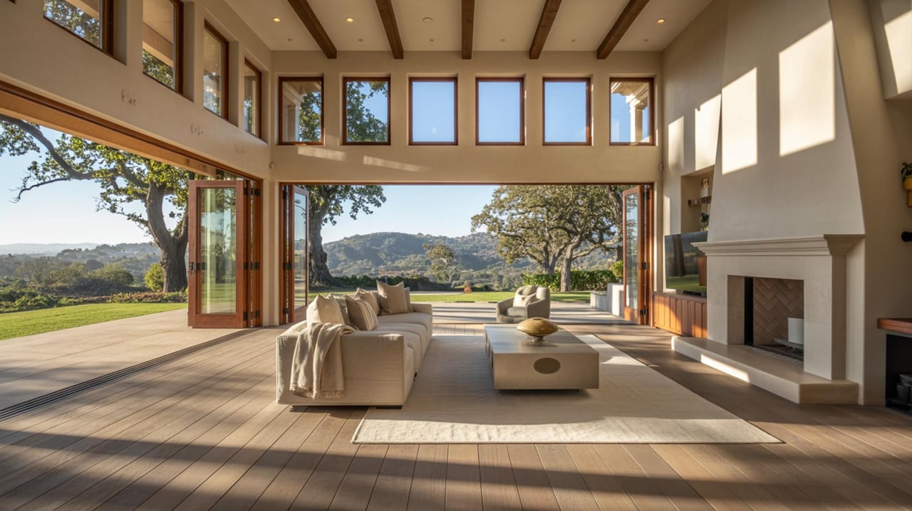
Harmonize Color With Natural LightUnderstanding how natural light changes throughout the day helps select tones that stay appealing. North-facing rooms receive cooler, steady light that makes colors look cooler. South-facing rooms get warm, bright light that intensifies pigments. East-facing rooms show warm light in the morning and cooler light later. West-facing rooms glow warm in the late afternoon and can make warm tones feel richer. Place large paint samples on different walls and observe them at morning, midday, and evening to see real shifts in hue. Choose samples at least the size of a standard poster so texture and finish register accurately. Consider lighter tones for rooms with limited light to reflect more illumination and richer hues for rooms with abundant sun to create depth.
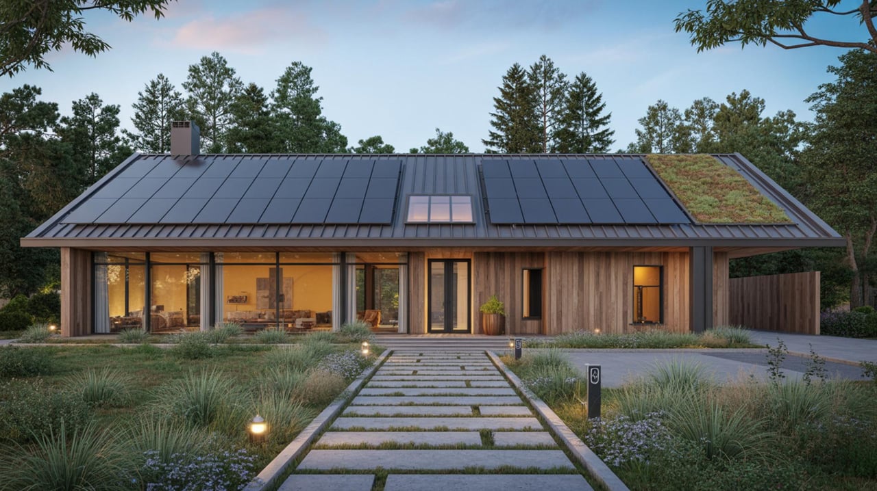
Match Color To Architectural StyleArchitectural features influence suitable palettes. Traditional homes with crown molding and wainscoting pair well with classic, muted tones that highlight details. Modern homes with clean lines benefit from crisp, restrained colors that emphasize geometry. Craftsman and bungalow styles often suit warmer earth tones that complement wood elements. When selecting a tone, evaluate trim, flooring, and permanent fixtures. Test samples adjacent to baseboards and window trim to confirm that undertones coordinate. Use a color family across architectural elements to create a cohesive flow between rooms.
Choose Base Colors For Major RoomsPrimary living areas set the tone for an entire home. Living rooms work well with comfortable, inviting colors that support conversation and relaxation. Kitchens tolerate slightly bolder tones near cabinetry or backsplashes while maintaining lighter walls to keep the space lively. Bedrooms favor calming shades that promote rest, with cooler, subtle hues for a tranquil effect. Select a main wall color first, then build complementary shades for accents and trim. Apply sample patches on full walls rather than swatches to judge how the tone reads at scale. Consider finish choices that match room function, with softer sheens for comfort and more durable sheens where cleanability matters.
Use Accent Colors To Create FocusAccent walls and architectural niches benefit from saturated colors that draw the eye. Choose an accent tone that harmonizes with the base color by selecting a shade from the same family or a complementary hue on the color wheel. Accent colors work well behind fireplaces, media walls, or headboards. Limit accent painting to one focal zone per room to maintain balance. Test the accent color with the furniture and textiles in place to ensure the tone complements existing elements. Use matte or eggshell finishes for accents in low-glare settings and consider satin finishes where light will reflect.
Consider Undertones CarefullyUndertones can shift how a paint tone reads under different light and next to materials. A beige might carry pink, yellow, or green undertones that become apparent when placed near wood or metal finishes. Cool undertones lean toward blue or green hues, while warm undertones show yellow, red, or brown. Evaluate undertones by holding sample cards beside flooring and countertop materials. If the home has warm wood floors, favor tones with warm undertones to unify the palette. For neutral trim and stone, explore cooler undertones for a modern contrast. Small changes in undertone can alter the perceived warmth or coolness without changing overall value.
Coordinate Paint With Furnishings And TextilesExisting furniture and fabrics should guide paint decisions to ensure harmony. Upholstery patterns, area rugs, and window treatments provide clues about which palette will feel cohesive. Place paint samples next to the largest pieces of furniture and observe how the colors interact. If replacing large furnishings is not planned, choose tones that complement dominant colors rather than clash. Create a swatch collection of fabric scraps and paint chips to compare combinations. When planning new decor purchases, use the chosen wall color as a reference so finishes and textiles align with the overall scheme.
Select Finishes For Function And AestheticsPaint finish affects appearance, longevity, and maintenance. Flat finishes hide surface blemishes and create a soft visual texture for ceilings and low-traffic walls. Eggshell and satin finishes provide slight sheen and are suitable for living areas and bedrooms where occasional cleaning is needed. Semi-gloss and gloss finishes resist moisture and are ideal for trim, doors, and areas that require frequent wiping. Match finish selection to room use and level of wear expected. Test small panels of different finishes to see how sheen influences color perception, since higher sheen can make colors look deeper and more saturated.
Use Color Temperature To Support Room PurposeColor temperature impacts mood and function. Warm tones bring a sense of energy and comfort, suitable for dining areas and social spaces where liveliness is desired. Cool tones produce calm and focus, fitting for workspaces and bedrooms that benefit from concentration or rest. Mid-temperature tones bridge warmth and coolness and work well for multipurpose rooms. When planning color temperature, balance with lighting choices. Warm artificial lighting will make cool paints appear more neutral, while cool lighting can mute warm paints. Choose bulbs with color temperatures that complement the intended paint effect.
Create Flow Between RoomsA cohesive home uses a connected sequence of colors that transition smoothly from room to room. Start with a neutral base throughout hallways and common areas, then introduce variations of that base into adjacent rooms. For stronger continuity, use a single hue with varying saturation and lightness across spaces. For more energetic interiors, allow bolder tones in isolated rooms while keeping adjacent corridors toned down. Walk through the home with sample-painted panels to ensure visual flow and to avoid abrupt contrasts. Consider how natural and artificial lighting in each space will alter the perceived connection between tones.
Plan For Exterior And Neighborhood ContextExterior paint choices should respect architectural style and local streetscape while reflecting personal taste. Evaluate roof color, landscaping, and permanent trim when selecting exterior tones. Homes in central Walnut Creek neighborhoods often balance classic palettes with subtle modern accents. Test exterior colors on multiple elevations to see how sunlight and shadow change their appearance. Use durable, fade-resistant formulas on exterior walls and consider coordinating front door and trim with the main body color to enhance curb appeal. When aiming for resale appeal, choose refined tones that align with buyer preferences in the local market.
Find the Right Tone for Every Room
Understanding the science of color can transform how each room in your home looks and feels, from calming cools in the bedroom to energizing warms in the kitchen. For personalized advice on selecting palettes that enhance light, space, and resale appeal, consult the Aliloupour Real Estate Team. Whether you're in null or planning a move elsewhere, their design-savvy guidance will help you choose tones that work for your lifestyle and market. Contact the Aliloupour Real Estate Team today to get tailored color recommendations and neighborhood insights.